IMPRINT
Graphic Design, Exhibit Design, Community Engagement
The Ask: Highlight inequity in youth arts and advocate for equitable access through a public exhibition.
The Insight: Understanding inequity in youth arts begins with empathy. Yet, many feel disconnected from conversations about art and creativity. By focusing on the universal power of creativity, we can create an inclusive dialogue that encourages everyone to reflect on its role and significance.
The Idea: A community board with a focus on storytelling and engaging prompts that invites participants to think about the role of creativity.
EXHIBITION TOUR
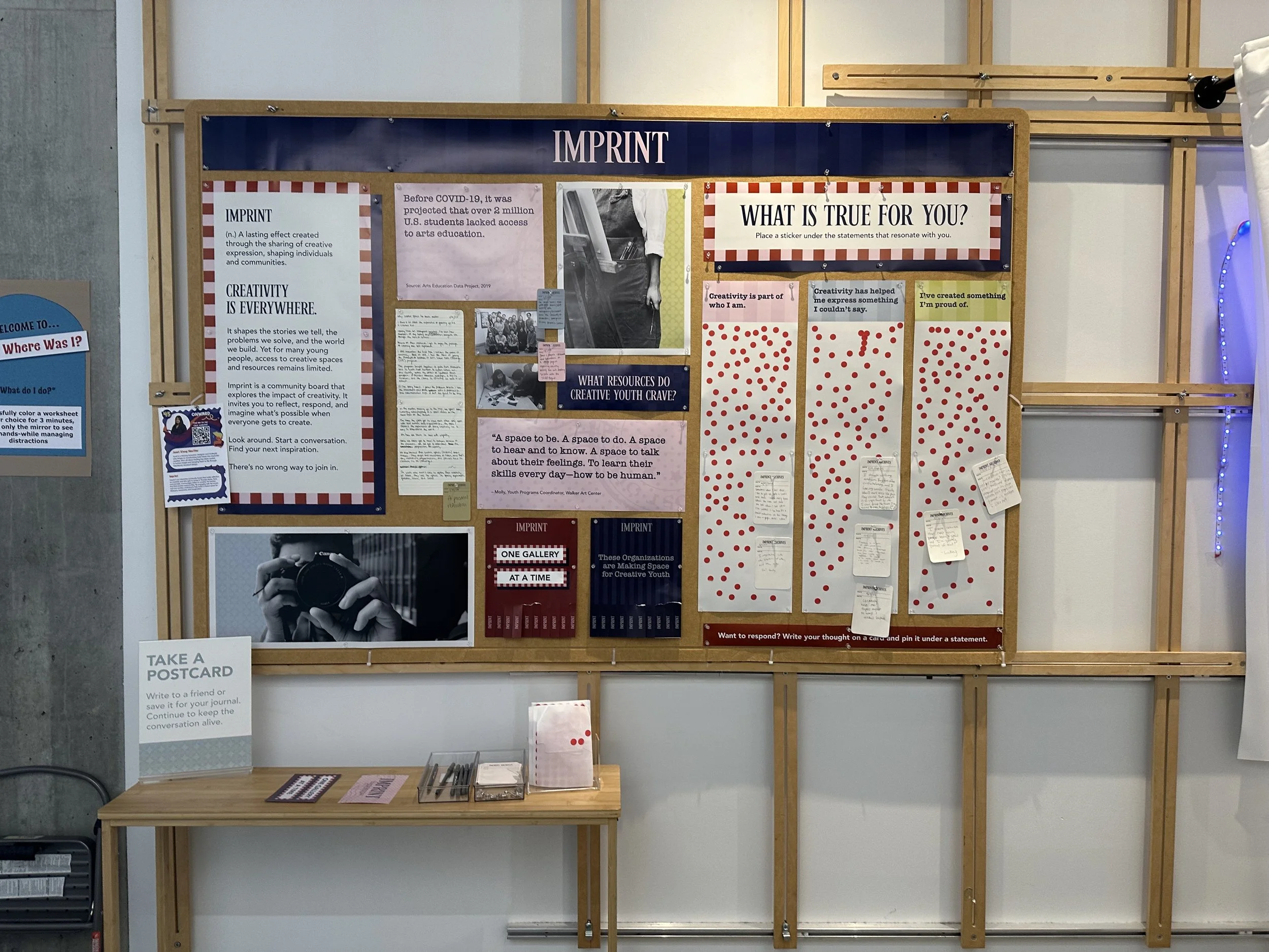
IMPRINT
(n.) A lasting effect created through the sharing of creative expression, shaping individuals and communities.

CREATIVITY IS EVERYWHERE.
It shapes the stories we tell, the problems we solve, and the world we build. Yet for many young people, access to creative spaces and resources remains limited.
Imprint is a community board that explores the impact of creativity. It invites you to reflect, respond, and imagine what’s possible when everyone gets to create.
Look around. Start a conversation. Find your next inspiration.
There’s no wrong way to join in.
DRIVEN BY STORYTELLING
The storytelling pieces of this board highlight three core elements: a key statistic, a personal reflection, and an insight from someone working directly with creative youth, forming the foundation of this project.
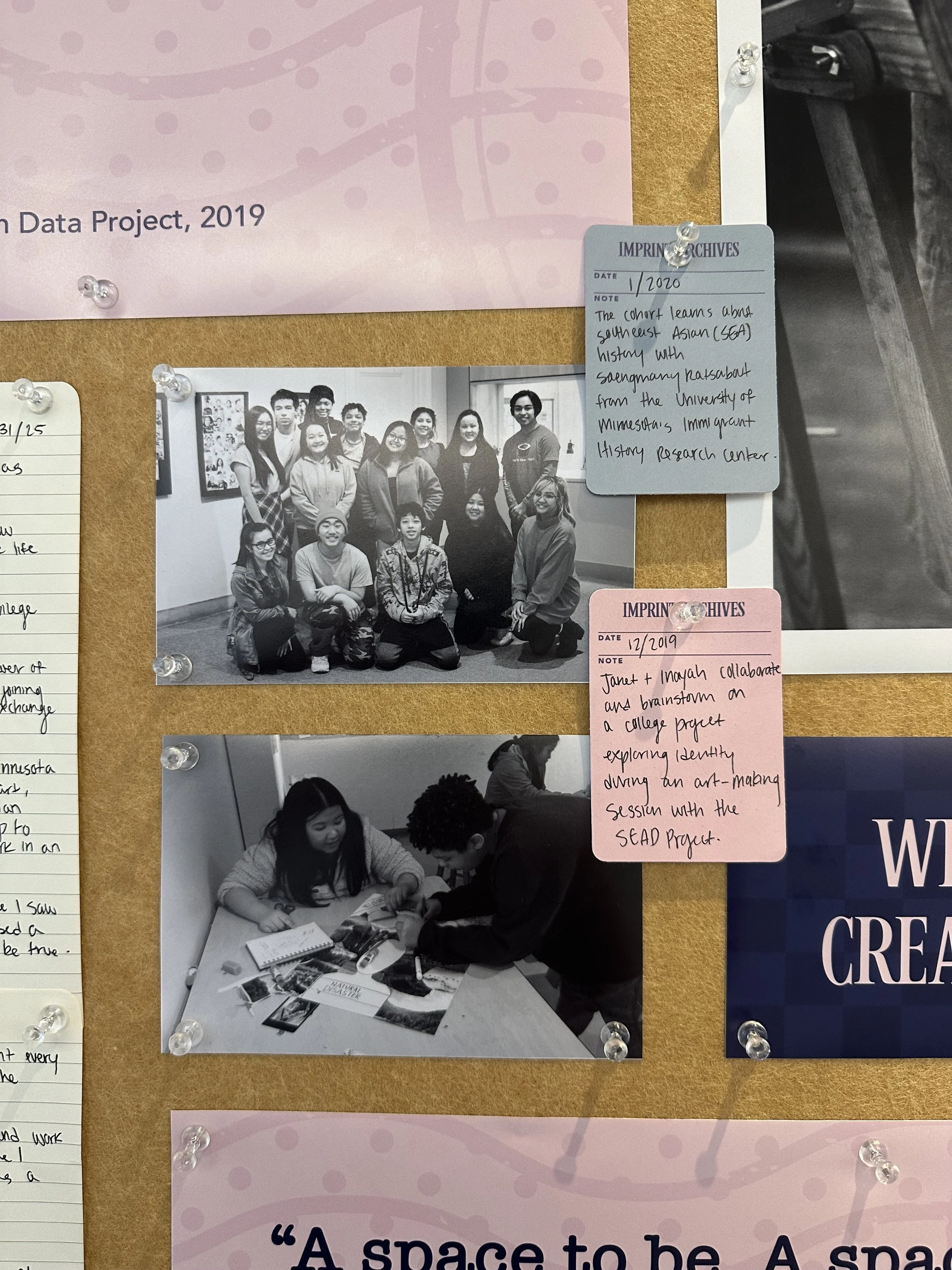
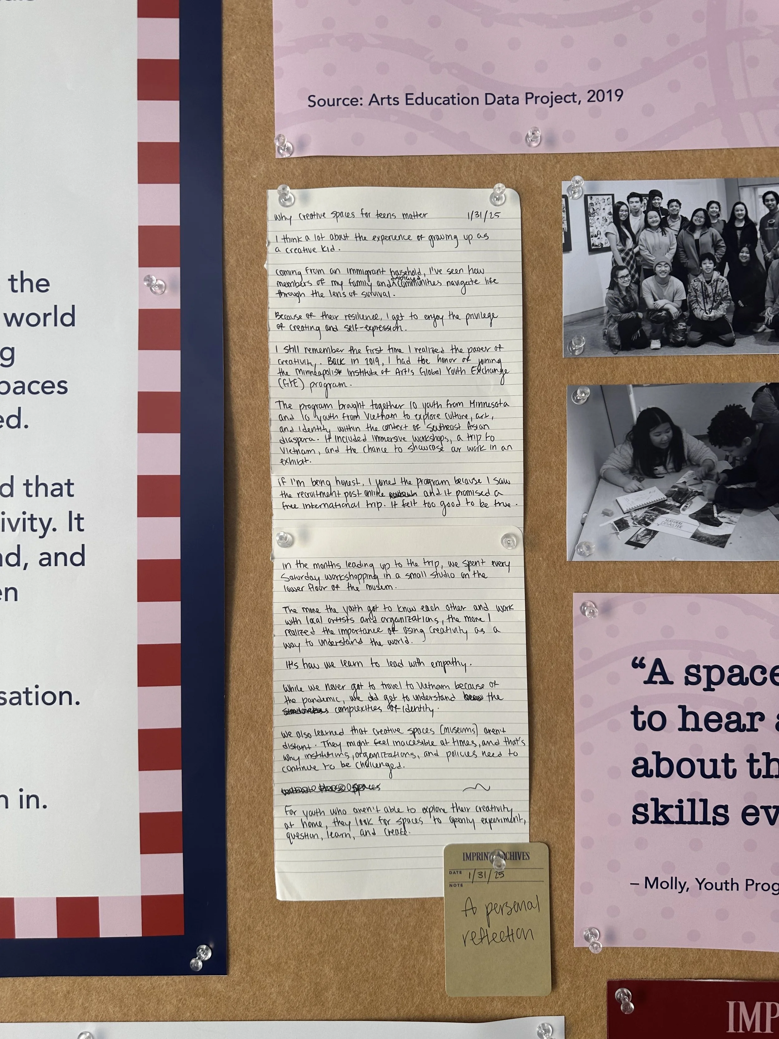
After exploring the research on inequity in youth arts, I sought out a statistic that captured the complexity of this issue and harmonized with the visual design of this board.
The one that stood out: Before COVID-19, an estimated 2 million U.S. students lacked access to arts education (Arts Education Data Project, 2019).
Our research found that many students without access to arts or creative spaces often seek them out at school. When these opportunities are stripped away—whether due to federal funding cuts or a global pandemic—the question arises: What resources do youth need to fulfill that creative drive?
The personal reflection dives into my own journey through creative youth programs and the lasting impact they had on me and my peers.
"When I look back at my time in the Global Youth Exchange Program, I see a version of myself still figuring things out—unsure of who I was, but slowly finding my way through storytelling, collaboration, and creativity."
For more on this reflection, check out my blog post, “Why Creative Spaces for Teens Matter.”
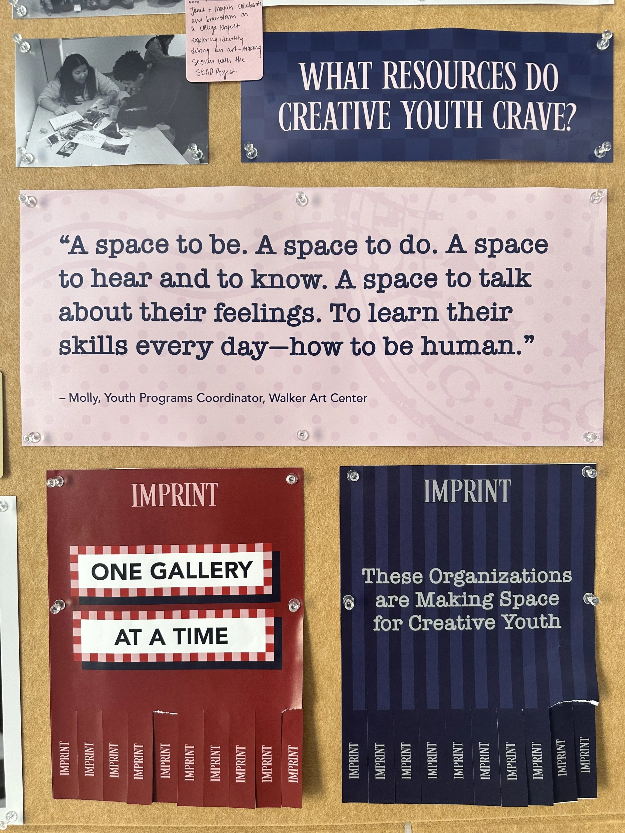
In a conversation with Molly, Youth Programs Coordinator at the Walker Art Center—and someone I first met through an art program when we were both young—I wanted to learn more about the impact of creative youth programs.
Molly shared that while organizing these programs is challenging, it's deeply rewarding because she knows how much it means for young people to have a space where they can truly be themselves.
Though Imprint isn’t a physical space, it serves as a shared environment that fosters community and connection.
ENGAGEMENT
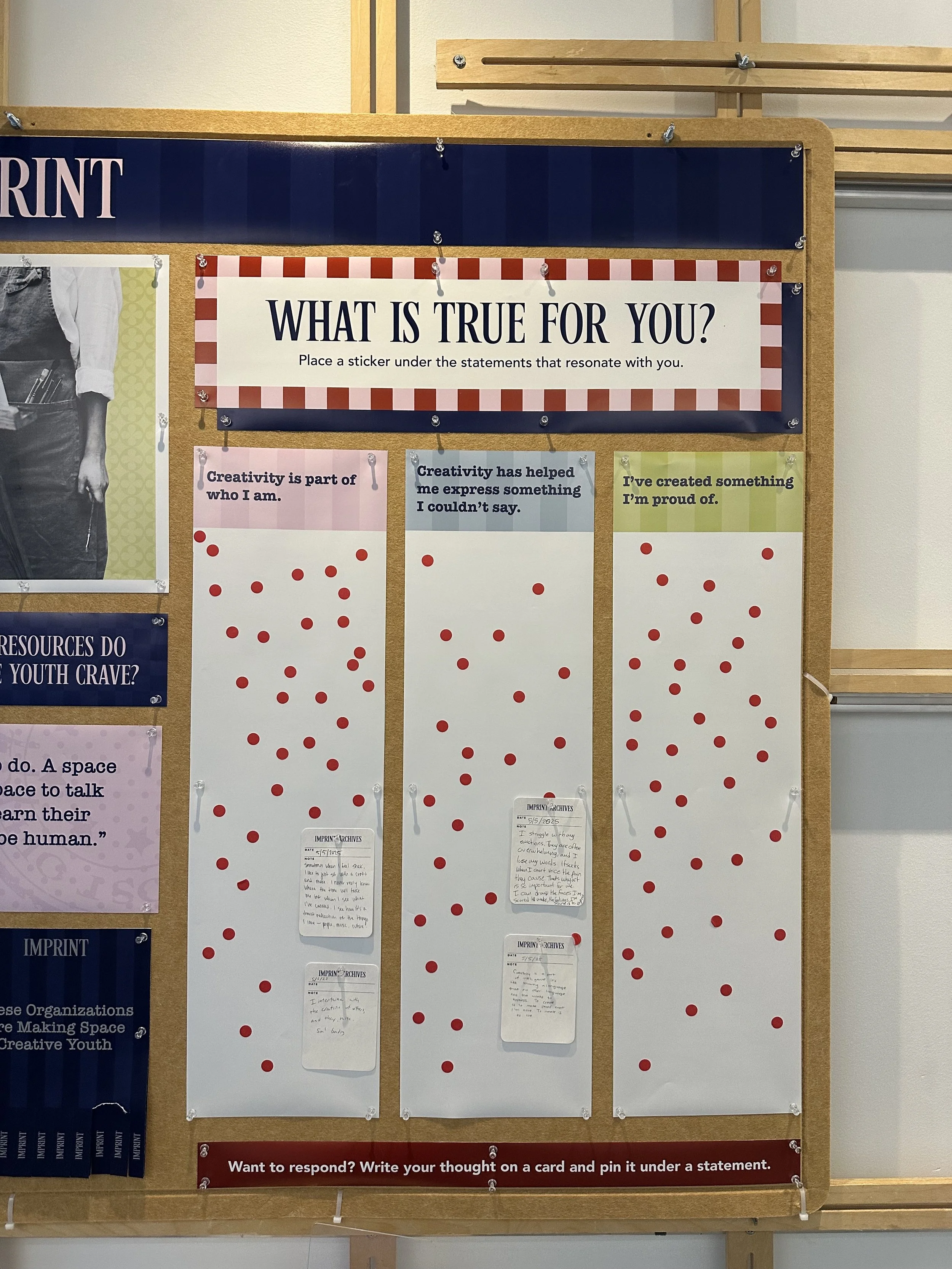
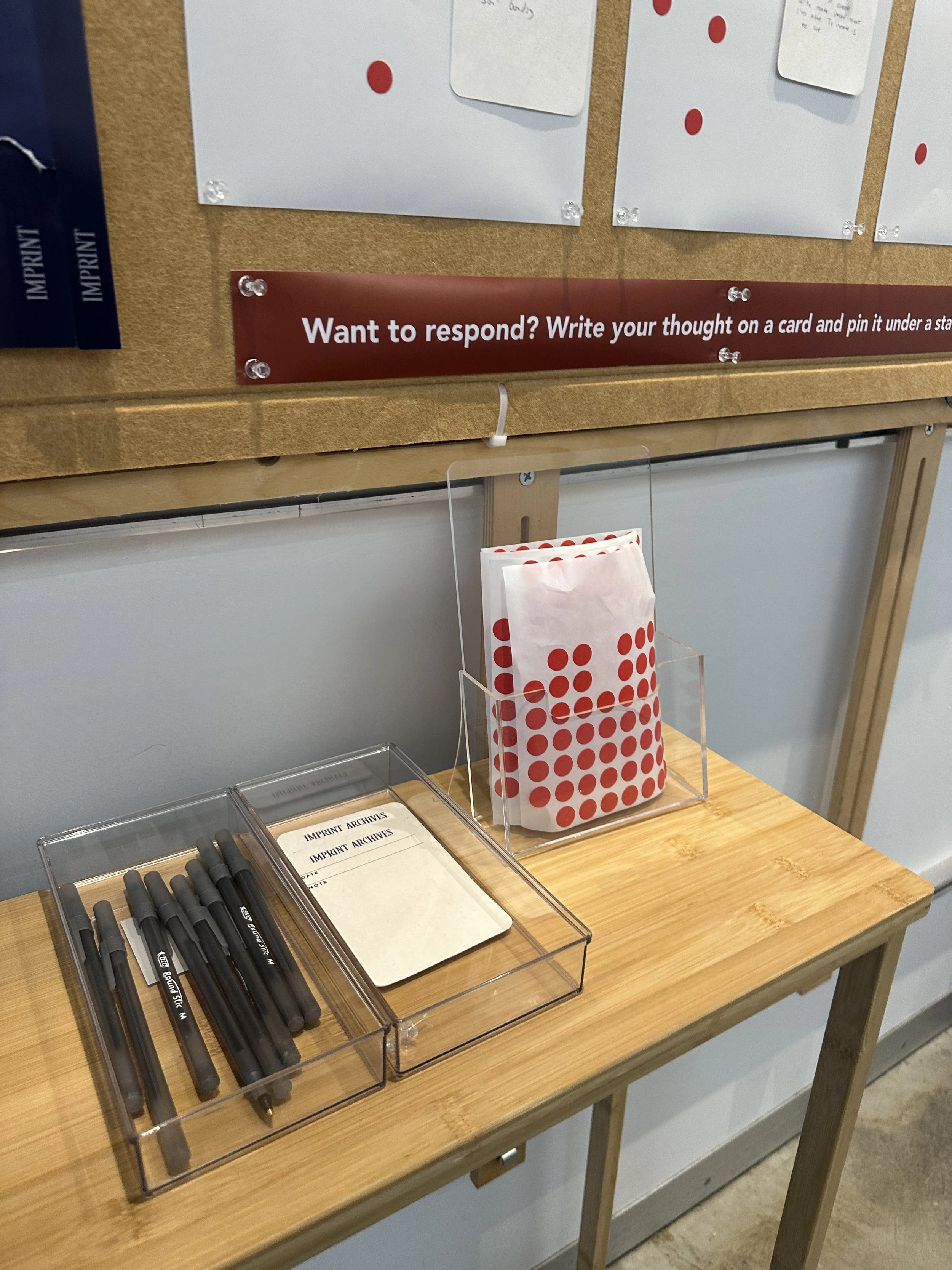
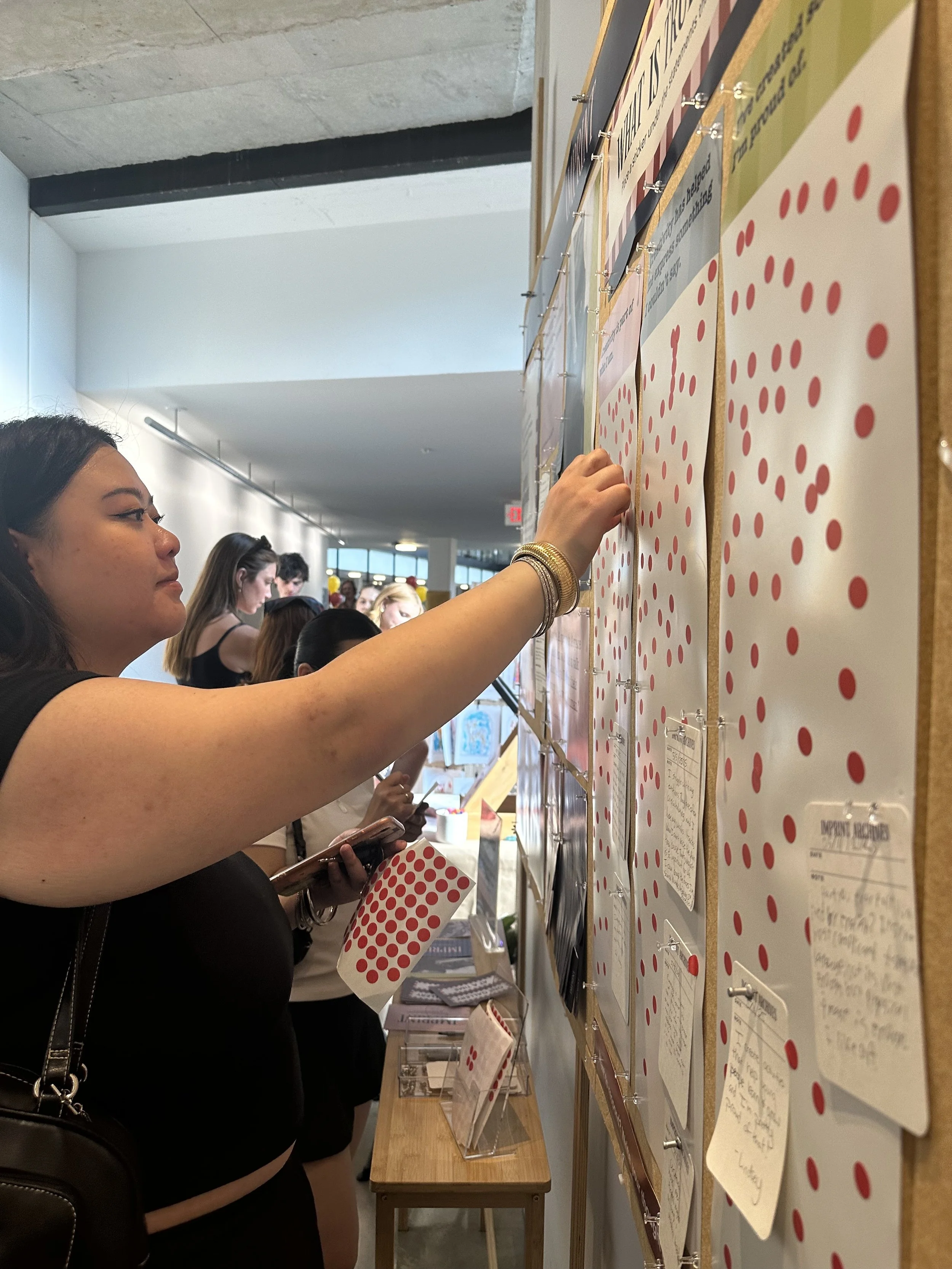
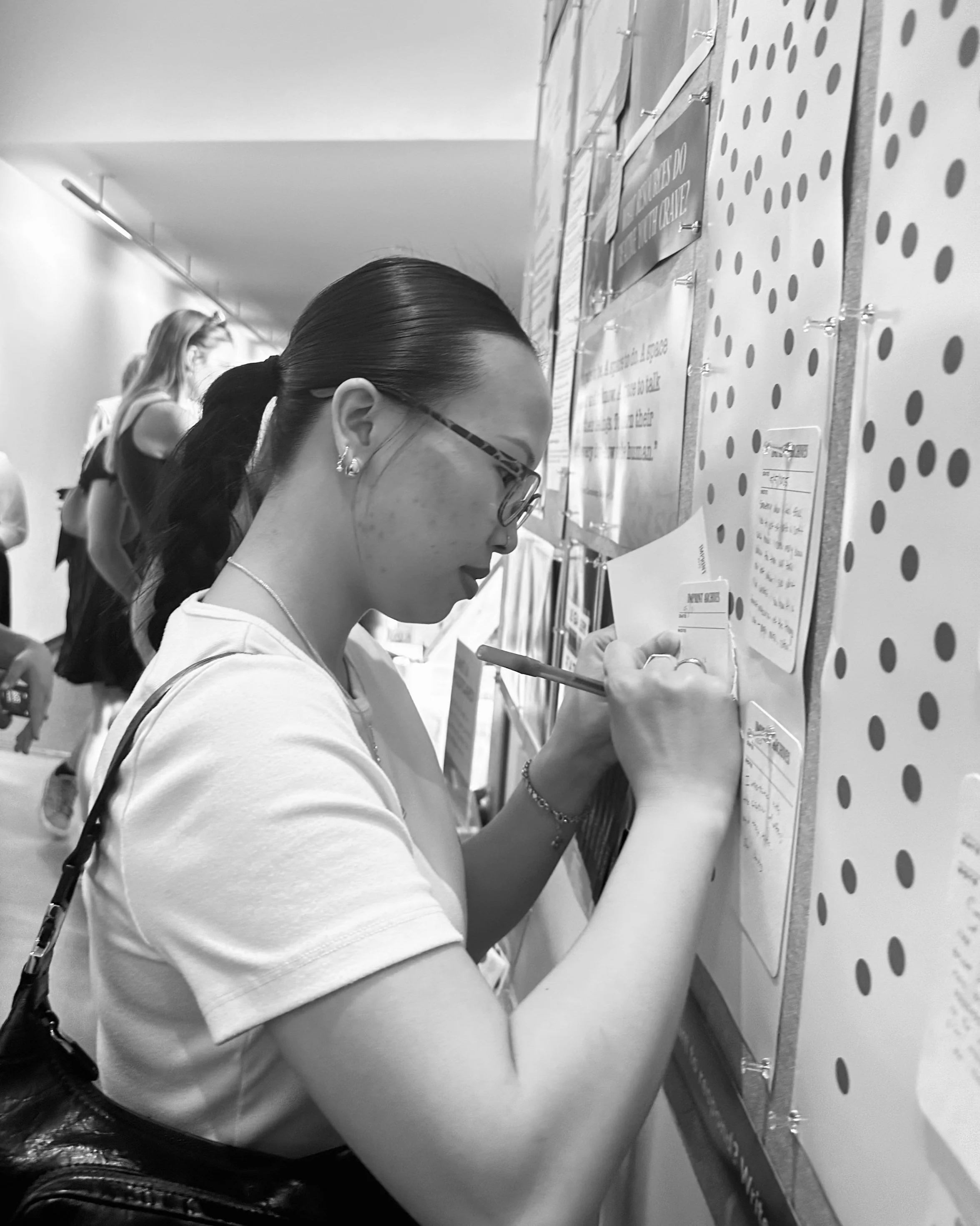
One of the main features of this board is its interactive component—reflective statements that participants can vote on based on what resonates with them.
After nearly five months of brainstorming and refining over 30 different prompts aimed at encouraging people to reflect on the role of creativity in their lives, I distilled it down to three simple, powerful statements:
Creativity is part of who I am.
Creativity has helped me express something I couldn’t say.
I’ve created something I’m proud of.
I experimented with a wide range of prompts—some light-hearted, others deeply reflective.
Questions like “When was the last time you were creative?” and “What’s a piece of art, writing, or music that stuck with you and why?” sparked thought, but feedback from peers and mentors revealed that these questions often put people on the spot, making it hard to respond meaningfully in the moment.
That insight led me to simplify, opting for open-ended statements that invite reflection without pressure.
To further ensure participants feel heard and have a platform for their voice, I included the option for them to write their own statement and pin it to the board, becoming part of the experience. These submissions are kept anonymous to encourage honest, intimate, and sometimes vulnerable expressions.
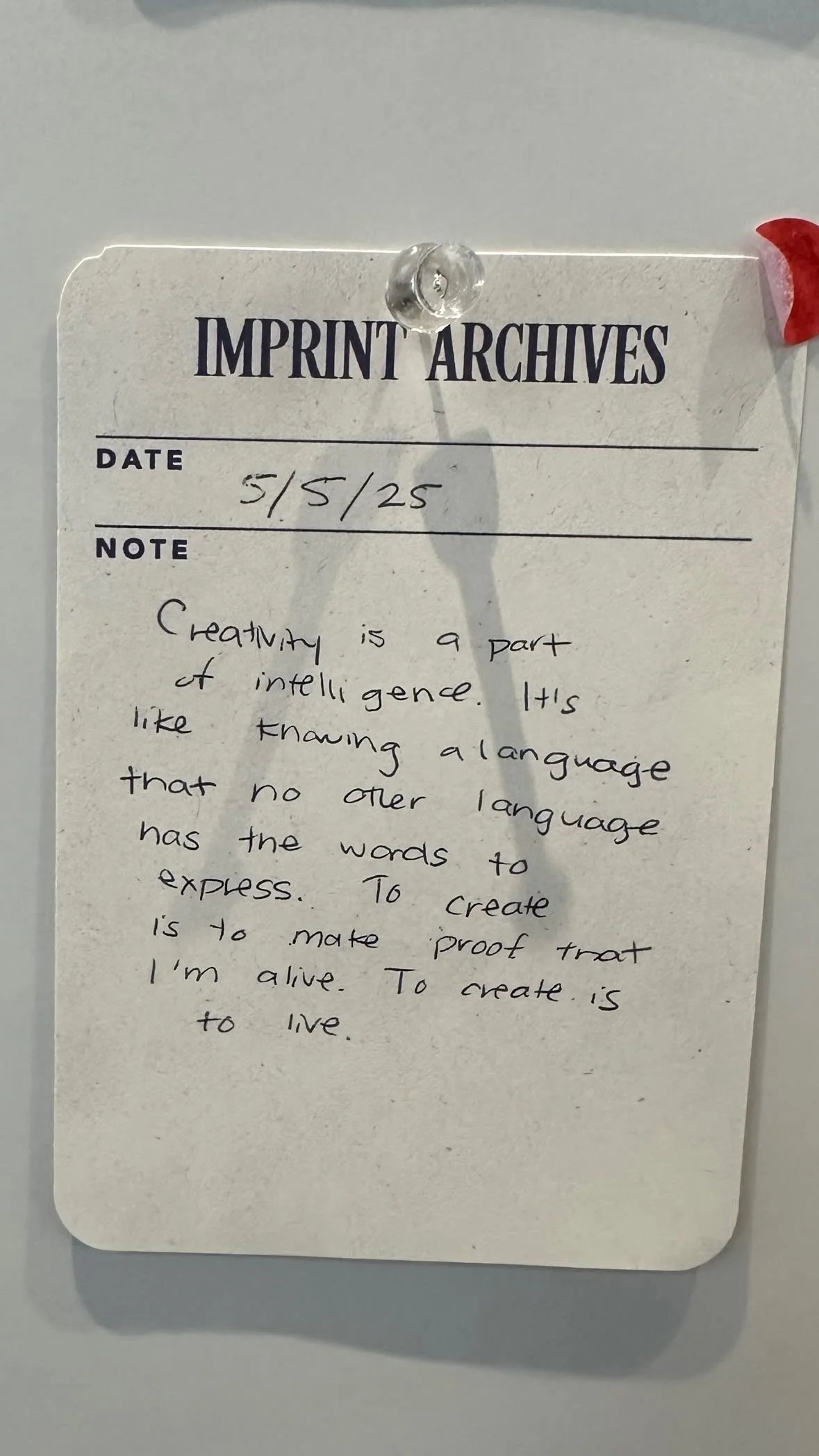
On May 5, someone responded to the statement “Creativity has helped me express something I couldn’t say” with:
"Creativity is a part of intelligence. It’s like knowing a language that no other language has the words to express. To create is to make proof that I’m alive. To create is to live."
Another interactive feature of the IMPRINT Board is the pull-tab flyers. These flyers are designed to highlight galleries and organizations across the Twin Cities, showcasing the abundance of creative spaces available. Participants are encouraged to take a tab and discover a gallery to visit or an organization to learn more about.
Highlighted galleries include the American Swedish Institute, Gamut Gallery, Goldstein Museum of Design, Minneapolis Institute of Art, Minnesota Museum of American Art, Public Functionary, Regis Center for Art, Walker Art Center, and the Weisman Art Museum.
Highlighted organizations feature 30,000 Feet, Art Buddies, Art Start, Arts For Youth (East Side Arts Council), Free Arts (Big Brothers Big Sisters Twin Cities), Juxtaposition Arts, Kulture Klub Collaborative, Native Youth Arts Council, Walker Art Center Teen Arts Council, and WAM Collective (Weisman Art Museum).
IMAGERY
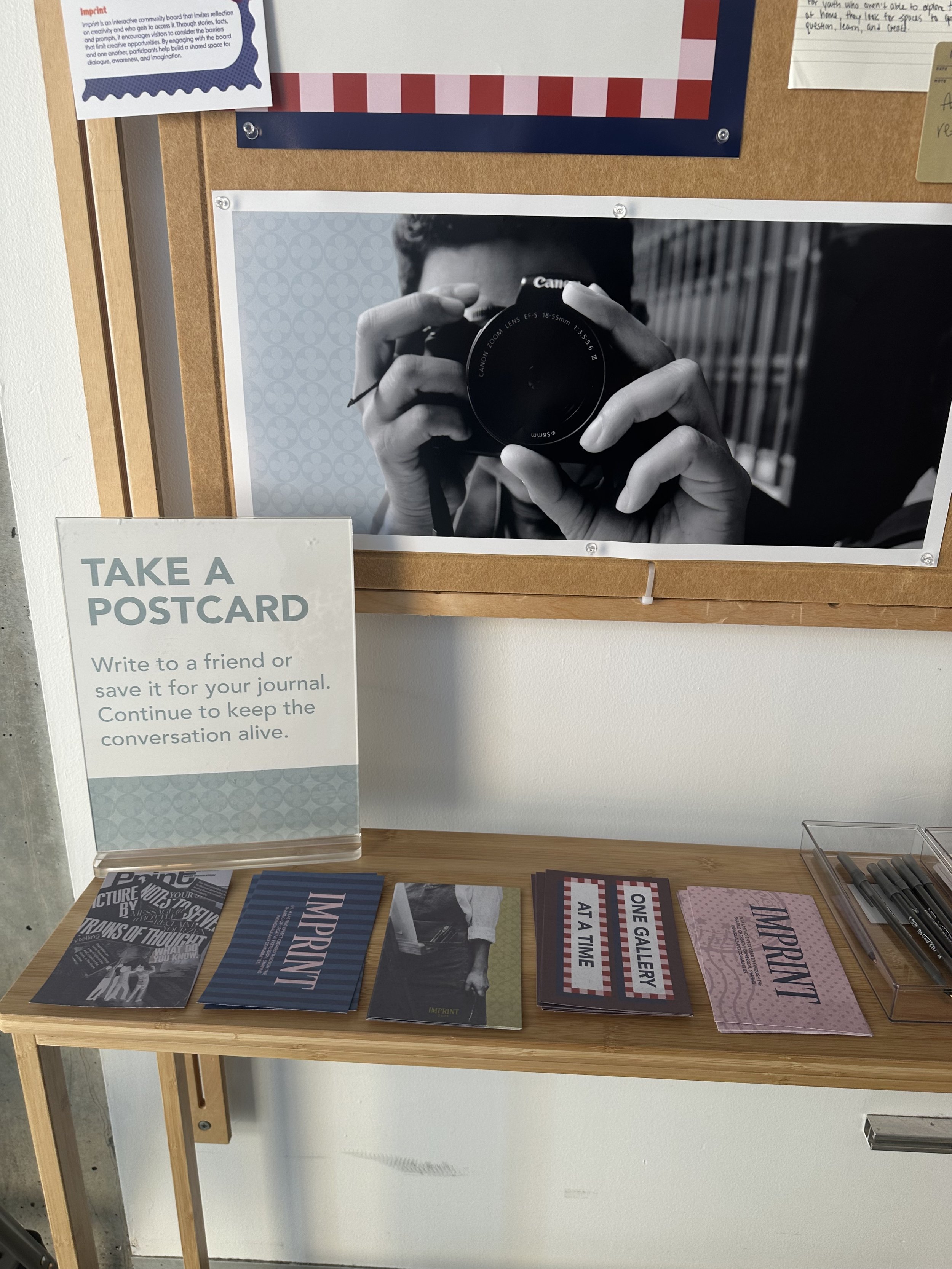
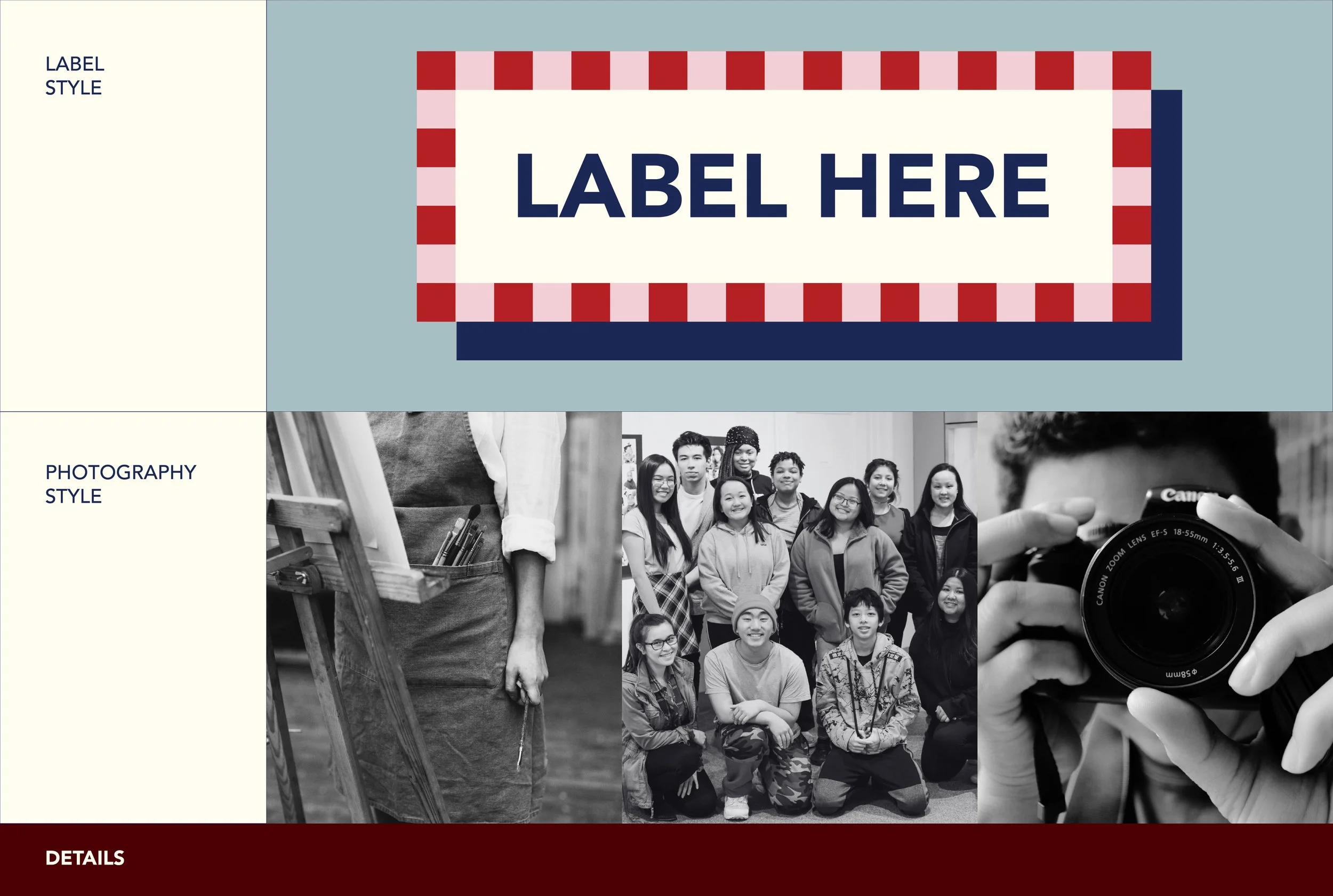
Storytelling is a practice that blends both words and images. To enhance the narrative, I included two of my own photographs (shown in a previous section) along with two posters featuring unnamed youth engaging in creative practices. I chose simple black-and-white imagery to maintain the focus on the stories themselves and evoke a reflective tone.
CONTINUING THE CONVERSATION
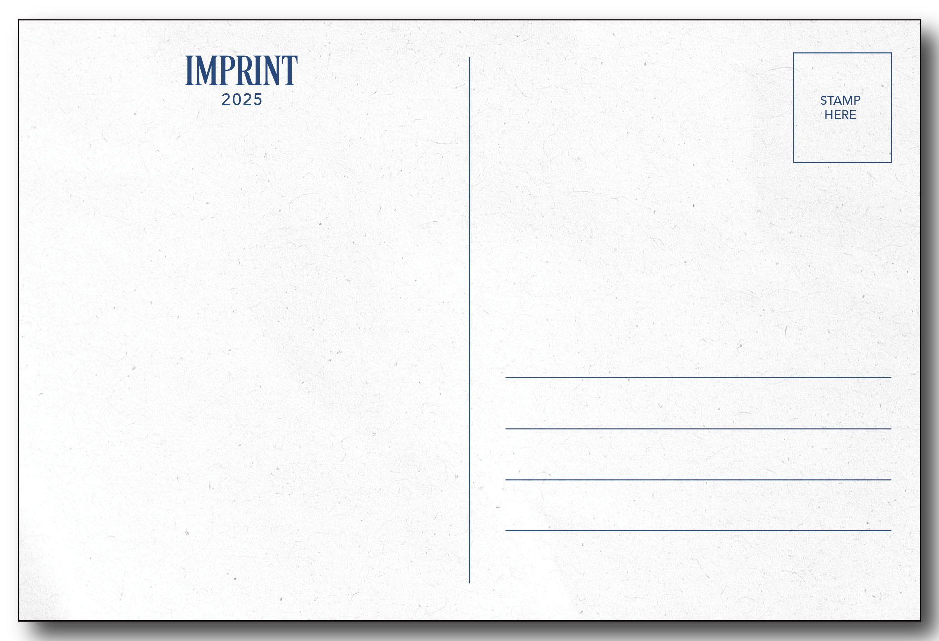
The final component of IMPRINT encourages participants to continue conversations about creativity beyond the space itself. Given the project's strong focus on print, it felt fitting to extend this engagement through printed media.
I designed five unique postcards, each featuring visuals from the board or inspired by its themes. The prompt on each card invites participants to write to a friend—sharing their experience with IMPRINT or reflecting on their own creative journey—or simply keep it as a personal reminder in their journal.


REFLECTION
IMPRINT has been more than just a design project—it’s been a journey of exploring how creativity shapes lives and brings people together. Through this process, I’ve learned that advocating for equitable access to the arts starts with creating spaces where people feel seen, heard, and encouraged to express themselves.
My hope is that IMPRINT inspired those who engaged with it to recognize their own creative potential, feel empowered to explore it further, and advocate for greater access to creative opportunities for youth and beyond.
Continue reading to learn more about my process.
DESIGN PROCESS
EXPLORATION
The design process for IMPRINT began like most creative journeys—messy, wide open, and full of possibility. I started with a simple question: What should this project feel like? Not just in its appearance, but in the emotions it evokes when people engage with the board.
To explore this, I created three collages, each offering a unique interpretation of storytelling, personal journey, and documentation. Each one is deeply reflective in its own way.
From there, I selected the two collages that resonated with me the most and developed a mood board for each—outlining color palettes, visual references, typography, and early design drafts.
Direction 1: Bold, Raw, Empowering, Urgency
The first direction embraces simplicity, allowing the stories to take center stage. Minimal yet impactful, it encourages people to pause, engage, and feel the weight of each word. This approach invites participation in collective storytelling, fostering connections through real, shared experiences.
Inspiration for this direction draws from bold typography in overprint styles, clean layouts, and solid-colored backgrounds, structured and reminiscent of contemporary prints.
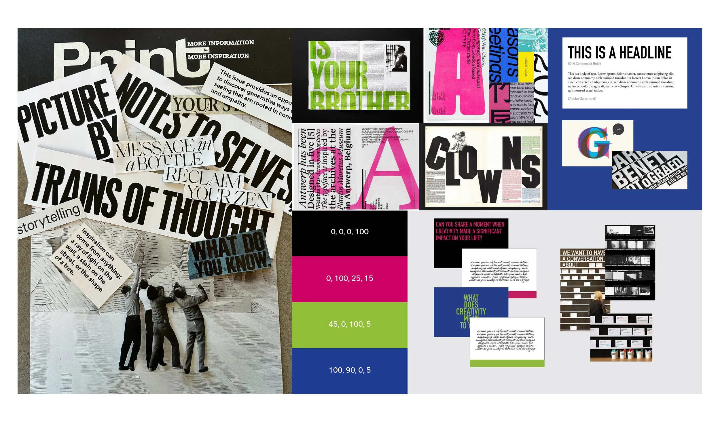
Direction 2: Playful, Unfiltered, Chaotic, Whimsical
The second direction is all about stepping into a funky, chaotic world that makes people feel alive. It invites exploration, laughter, and the freedom to embrace creativity without boundaries—a space where self-expression is limitless.
This concept pulls inspiration from a whimsical, Wes Anderson-esque aesthetic, with nods to vintage labels, retro color palettes, quirky full-character typefaces, and motifs reminiscent of personal archives.
In the early stages of my design process, I experimented heavily with the concept of tags. Initially, IMPRINT was envisioned as a project where participants would respond to prompts on tags and hang them on a structure. I was drawn to the idea of giving participants the power to actively contribute to the exhibition—an element I knew I wanted to preserve in the final design.
One of the most crucial aspects of designing IMPRINT was determining the key components that would make up the board. I needed to carefully consider which elements would best support the topic while being mindful not to present them in ways that could be harmful to surrounding communities.
Establishing the hierarchy of these design elements was equally important. What should command the most attention? How significant is the interactive component—should it feel more like a gallery or a bulletin board? How much space should the quote occupy? And how can we ensure participants engage with every part of the project? These were the questions that guided the design process, shaping how IMPRINT would come to life.
EXECUTION
There are key elements that define the final form of IMPRINT. The design prioritizes the engagement portion—interactive prompts that invite participants to reflect and vote. Another significant aspect is the emphasis on personal narratives, complemented by impactful visuals that bring the stories to life.
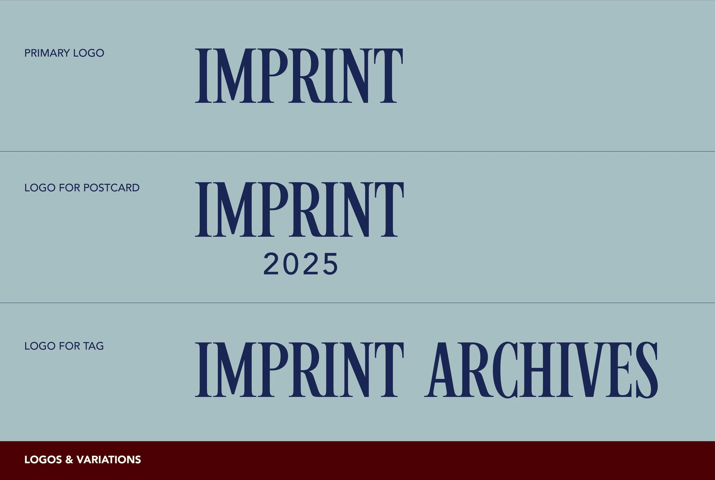
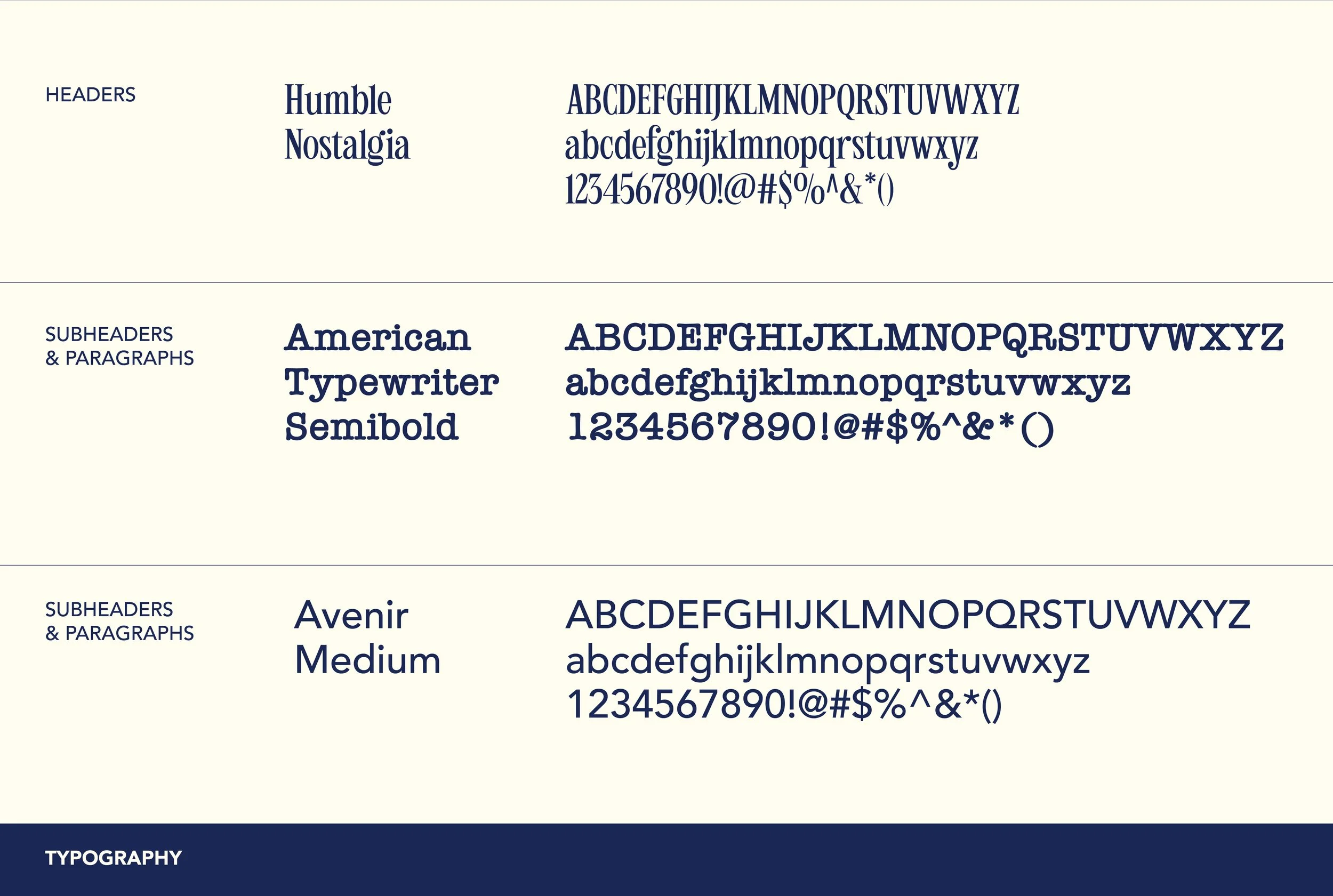
Don’t forget to also explore the design guidelines below.

GALLERY